BikePark
An app that helps bikers find safe parking for their bikes when they travel to unfamiliar places.
Learn more about the process we followed to take us from idea through to high fidelity prototype.
An app that helps bikers find safe parking for their bikes when they travel to unfamiliar places.
Learn more about the process we followed to take us from idea through to high fidelity prototype.
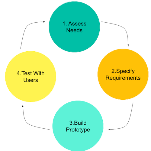
We followed a user-centric design process where users were involved at all stages of the process.
Student cyclists firstly helped us to better understand the problem. Later, they provided feedback on our prototypes and participated in usability tests.
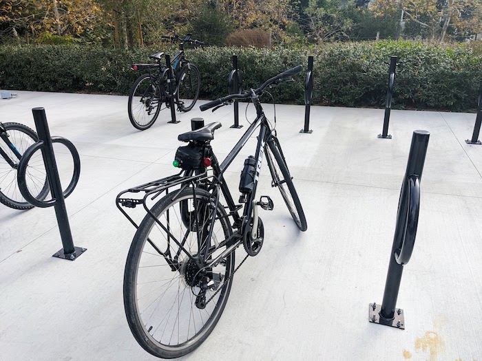
Many students at UCI bike to class or run errands on their bicycle. However, it can be hard to find a safe place to park a bike especially when in an unfamiliar area. Students are only too aware of the high levels of bike theft with over 2 million bicycles stolen in the USA every year.
BikePark is a mobile app that will help students find a secure bicycle park in and around the UCI campus.

Firstly, to better explore students experiences of cycling at UCI, we interviewed three students who regularly bike to campus. The observations we noted were:
In the words of our inteview participants:
I think it could be better if it’s integrated in the mapping software that I’m already
using.
Sometimes I get an understanding of where I could find a bike rack so long as I’ve been
there.
But otherwise, I'm fishing around
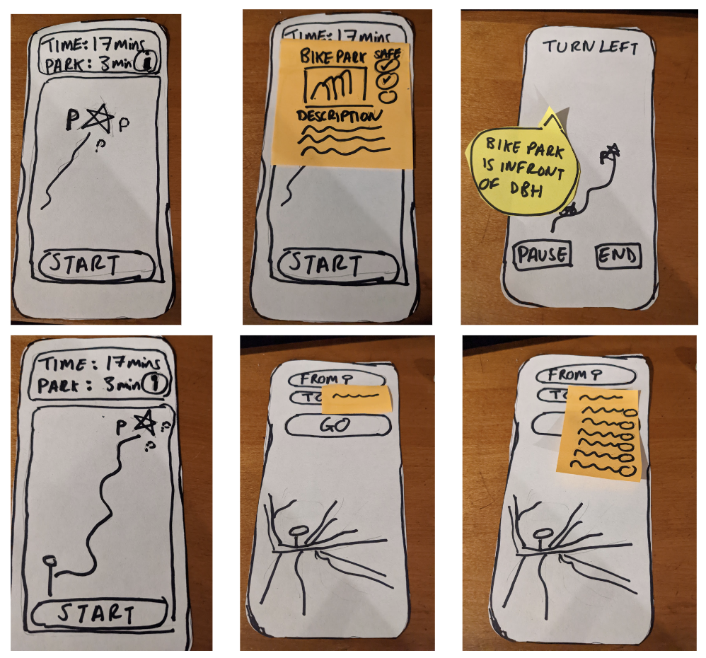

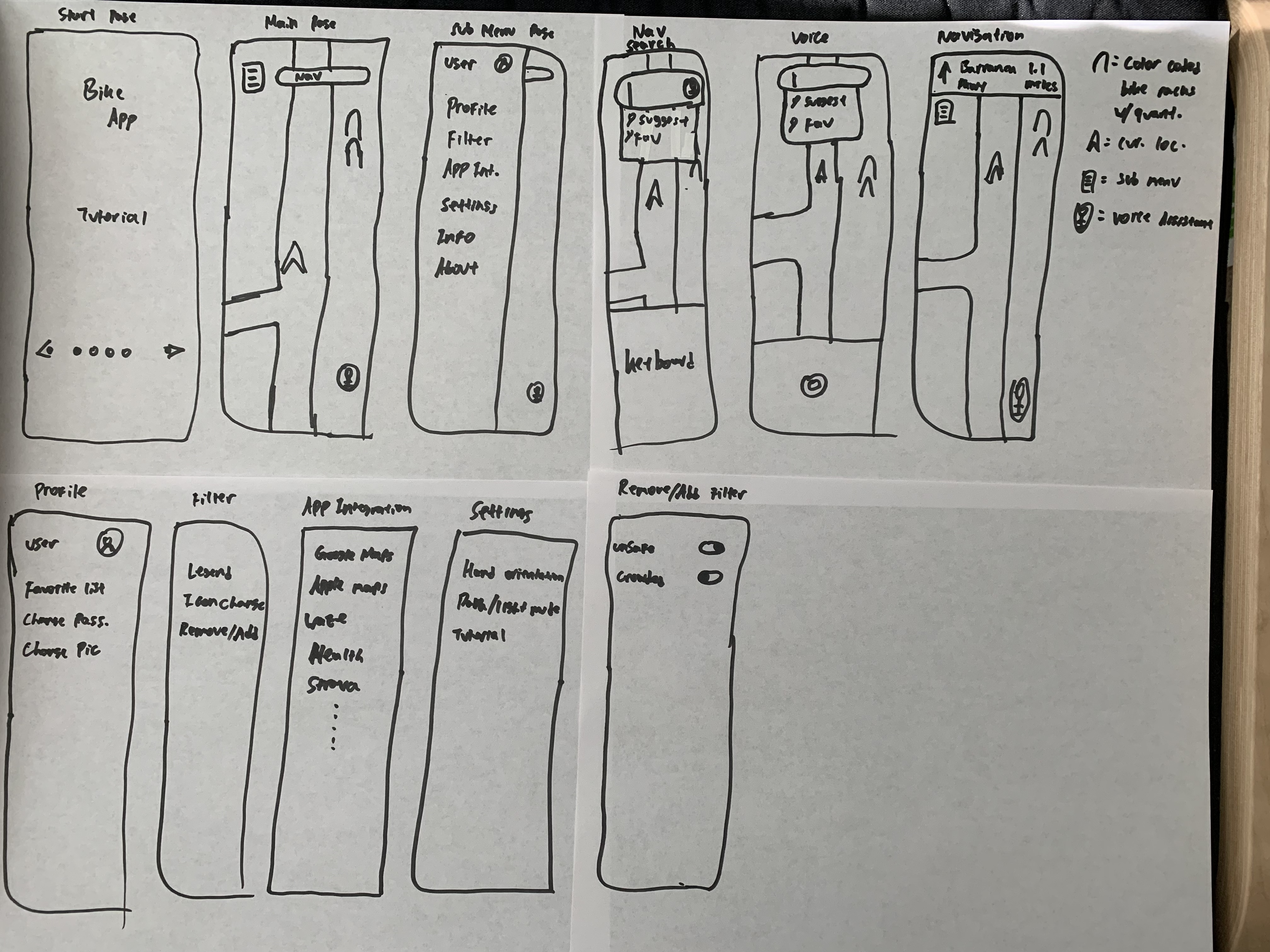
Next, each team member designed a low-fidelity paper prototype. These prototypes supported a number of user tasks:

We then shared our paper prototypes with class mates as well as one of our interview participants. We learnt that:
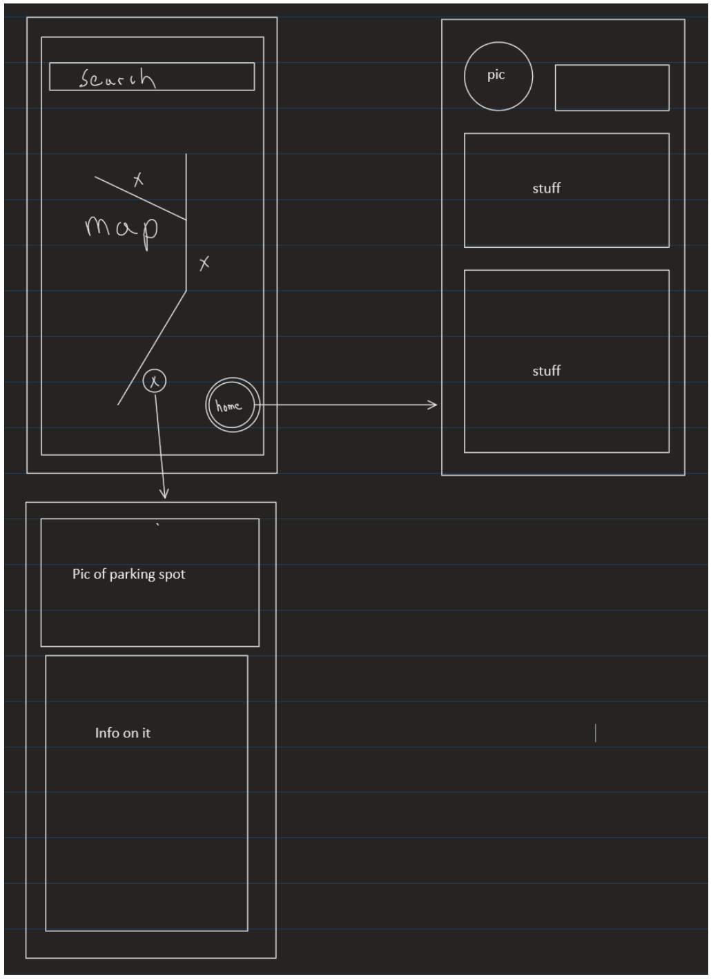
Using the feedback on our paper prototypes, we developed a High Fidelity prototype in Figma. The prototype was designed for an Android mobile phone and made use of Material Design principles and components. We made use of OpenStreetMap for the mapping images and Undraw for some of the visuals.
The prototype focussed on the core user tasks of:
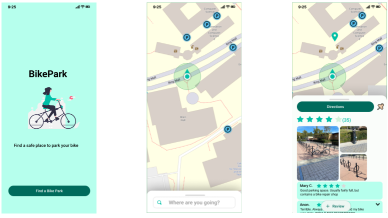
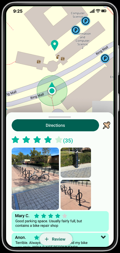
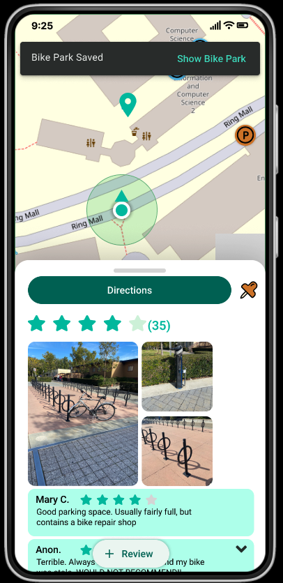
These screens support the user's goal of identifying bike parks nearby and reading reviews to determine where best to park.
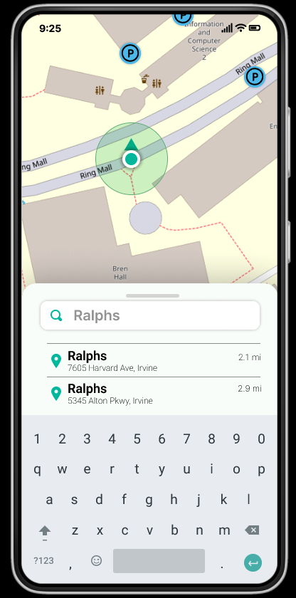
These screens support the user's goal of searching for a location and identifying nearby bike parks.
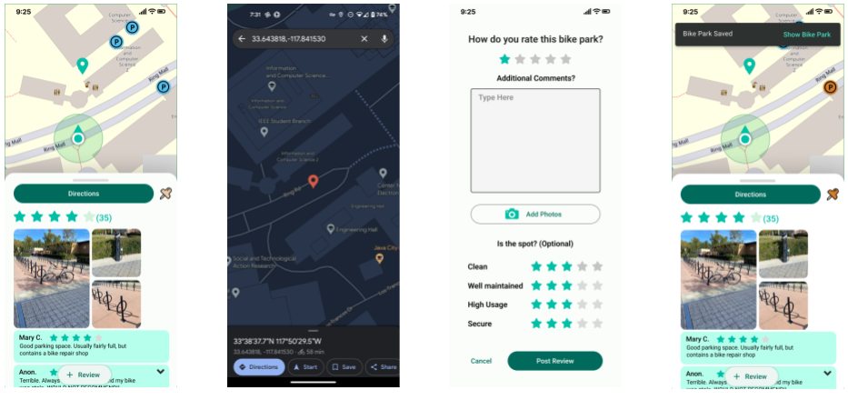
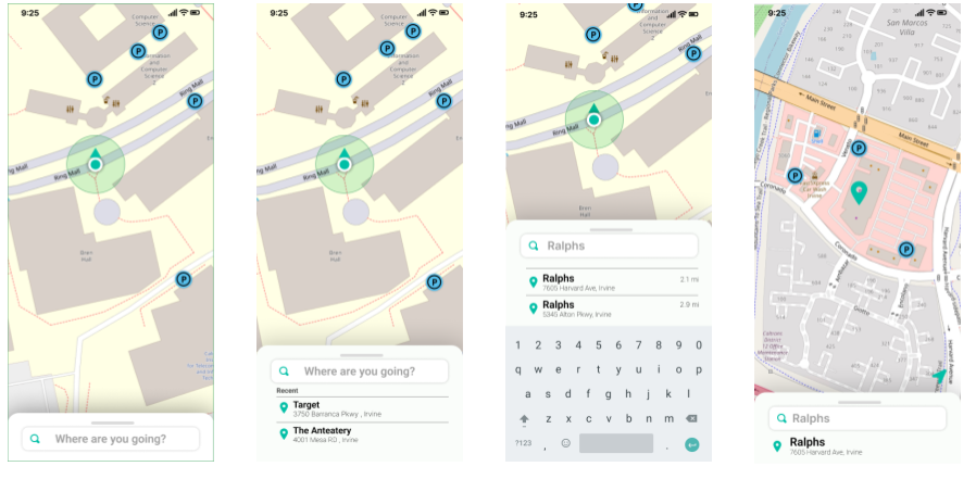
These screens help the user to get the directions to a bike park from a 3rd party mapping application such as Google Maps as well as writing a review of a Bike Park and flagging the bike park used to store their bike.
We asked two different students to complete a usability test on the BikePark high fidelity prototype.
We asked them to complete tasks related to searching for a destination and finding nearby bike parks, getting directions to a bike park, and reading/writing a review of a bike park.
Each test was performed over Zoom where the student shared their screen and spoke aloud as they tried to complete each task.
The tests were performed a week apart so we had time to revise the prototype with feedback from the first participant.
The usability testing gave us valuable insights into improvements for future versions of the prototype.
The first participant asked for the ability to indicate where they had parked their bike to make it easier to retrieve their bike. We added this feature "pin bike park" to our prototype before the second usability test.
The second participant did not find the "pin bike park" intuitive. They also mentioned it would be better to change the color of the selected bike park icon when reading a review. These are both areas to improve upon in future versions of the BikePark app.
Additional feedback included the ability to see if a bike park is full and to prompt the user to write a review once they'd collected their bike from a park.
We are very happy with the final prototype. We feel it incorporates the key features mentioned by our users and is reasonably intuitive given the feedback from the usability tests
Future versions need to consider how best to support the "pin bike park" feature as we are not happy with the usability of that feature. However, we feel the prototype is good enough to develop into a mobile app showcasing the MVP features of BikePark.
Find a simple achievable problem that we can solve because we have a short time frame to prototype and develop our application.
Creating multiple initial prototypes to understand everyone’s vision to create a unified vision
Good features in paper does not equate to good feature in practice. (Voice activation feature)
Don’t reinvent solutions that already exist. As a team we don’t need to create a navigation/direction app when one already exists
Get plenty of feedback from usability tests to understand the pluses and pain points of our application
Having users involved from the start helps to identify features we'd never have considered ourselves (e.g. pinning a bike park)
Valuable feedback can be received even on the most basic of paper prototypes.
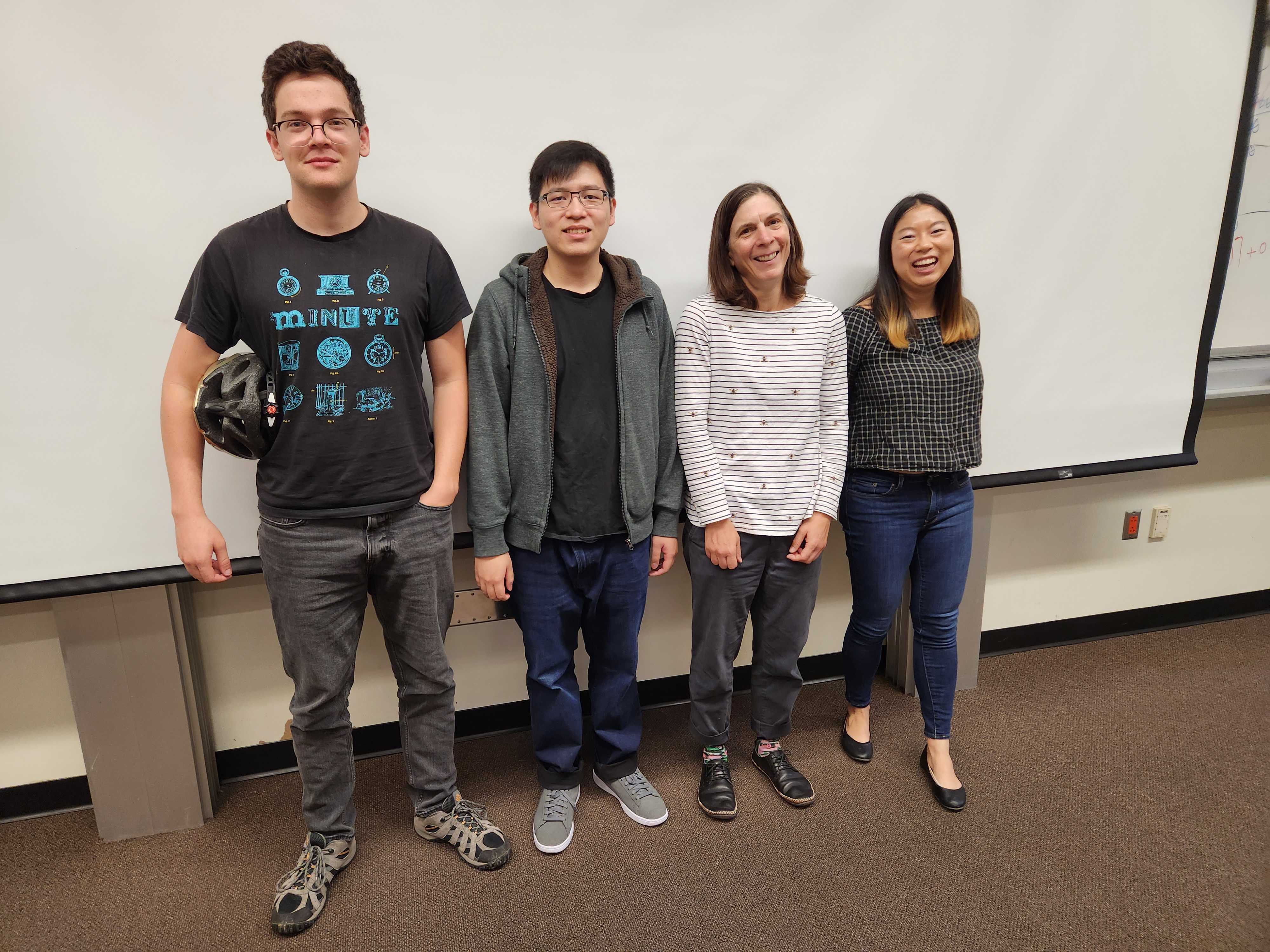
From left to right: Yotam | Jonathan | Vicki | Simone